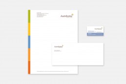
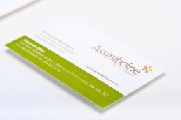
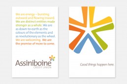
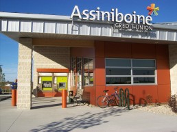
Assiniboine Credit Union Rebrand
CHALLENGE
Reflect the unique and vibrant culture, values, and membership of Assiniboine Credit Union (ACU) with a new identity.
INSIGHT
An in-depth research and consultation process revealed that ACU was about something bigger than just banking. Dedicated to community support, a diverse membership (with branches in many under-served neighbourhoods), and an awareness of social and environmental impact, ACU needed an identity as unique as they were.
RESULTS
The asterisk indicates that there is something more to learn or know; the symbol says that it’s worth looking closer at ACU. The shapes are a burst of energy, both inward and outward, and vibrant colours reflect diversity and optimism.
ClientAssiniboine Credit UnionProjectRebrand